A trellis chart is a series of similar charts that is useful for identifying patterns and trends. For each value of a chosen attribute, there is a corresponding chart with the same combination of category and series columns. For example, you could use the attribute Year or the attribute Business Unit to create a separate version of the chart for each year or each business unit.
To create trellis charts in Designer
| 1. | Create
a report with a chart in Classic Designer.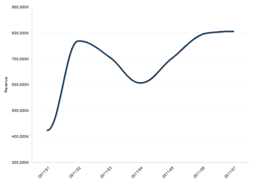 |
-
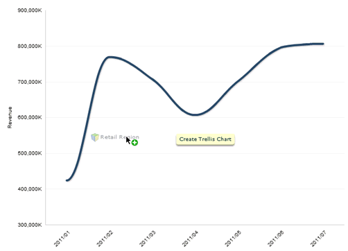
Drag an attribute from the Subject Area on top of the chart. You will see a yellow tooltip that says "Create Trellis Chart" and the pivot control displays. For example, a chart for each retail region.
| 2. | When you drop the attribute onto the chart, Designer
creates a series of charts of the same type and category/series combination.
The chart title for each chart in the series is the attribute value. In
this example the chart titles are the names of the regions, for example,
Northeast or Southeast.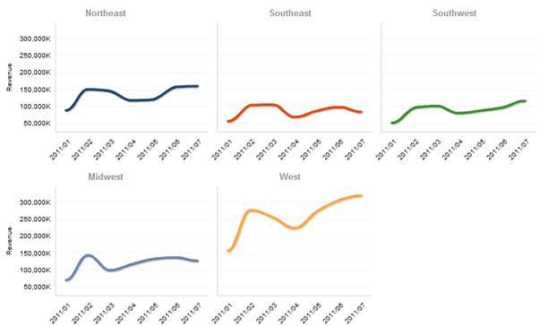 The pivot control displays the attribute in blue instead of yellow to indicate that it is a trellis attribute. |
| 3. | To replace the trellis attribute with another one, drag a new attribute from the Subject Area onto any chart in the series. The previous attribute will be replaced with the new attribute. Alternatively, you can click on the column header of the column you want to use as the trellis attribute in the report table and select Column Properties, then check the Trellis Chart Column box in the Column Properties dialog box. |
| 4. | To undo a series of trellis charts, drag the trellis attribute from the pivot control back into the Subject Area or uncheck the Trellis Chart Column box in the Column Properties dialog box. |
Adding a Basic Chart to
a Report
Adding an Advanced Chart Type
to a Report
Supported Chart Types